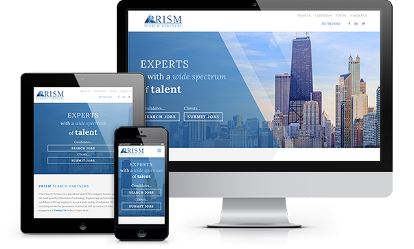
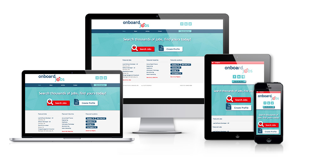
Responsive Design for a Responsive World
Creating a wonderful user experience is why Top Echelon recruiting websites are “responsive design” websites. A responsive web design detects the visitor’s screen size and changes the layout accordingly, based upon whatever device that visitor is using (smartphone, tablet, etc.).
-
Desktop Design
Top Echelon websites conform to whatever screen size and resolution the website visitor is using.
-
Viewable on any screen size
Top Echelon recruiting websites provide an optimum viewing experience for clients and jobs seekers, which further brands your firm in a positive fashion.
-
Suited for Mobile
Job seekers are using their mobile devices more than ever to search and apply for jobs.
Four-Step Design Process
Top Echelon has been building websites for the recruiting industry for over 15 years. We employ a four-step process for website design and development.
-
Needs Analysis
This phase is vital to the success of the project. We need to understand exactly what goals and business objectives you have for your website and how the site fits into your recruiting process. This blueprint needs to be completed before we write a stitch of code.
-
Design
Once all of the objectives are identified and approved, we’ll move forward with the design of your site. A dedicated designer will manifest your ideas regarding the overall look and feel of your site into a design mockup for your review and approval.
-
Development
Once the design mockup is approved, you can sit back while the developers bring your recruiting website to life. We’ll start with the front-end development, where we mark up the design files, move on to the functional and database development, and end with quality assurance.
-
Go Live!
Your site is live and available on the internet for all job seekers and clients to find and visit.